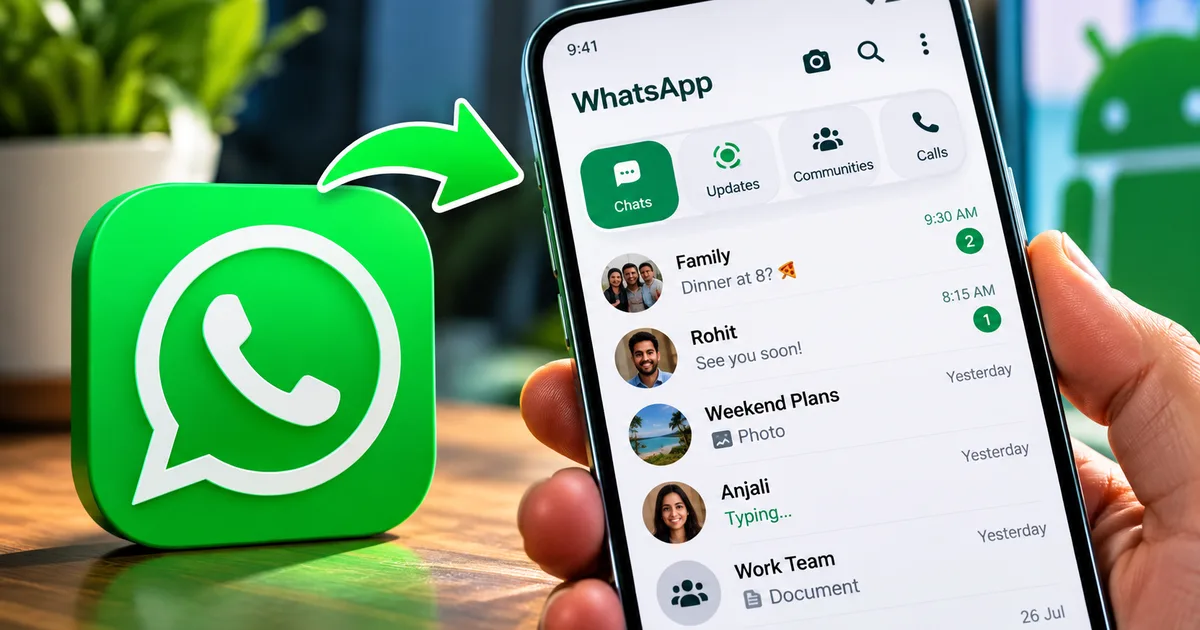
Look, if you use an Android phone in India, WhatsApp is basically your life. We use it to pay the kirana store via UPI. We check our kid's homework in the class group, and forward those endless good morning messages from relatives. So when the WhatsApp Android App Navigation Redesign 2026 rolls out, it's a big deal. For years, Android users have been stuck with a clunky top menu while iPhone users enjoyed a sleek bottom navigation bar. Well, things are finally changing. I tried the beta version 2.26.38.10 this week. The new UI features and bottom bar update are long overdue.
Before you ask why a menu bar matters, think about phone sizes these days. Reaching the top of a 6.5-inch screen single-handedly is hard. Have you ever tried searching for a contact while holding groceries on a crowded local train? It's practically impossible without dropping your phone. But this new update fixes it. It brings all the tabs to the bottom where your thumb naturally rests. Those tabs are Chats, Status, Communities, and Calls.
This is a complete overhaul of how you move through the app. The bottom navigation bar has rounded corners. It takes cues from Apple's Liquid Glass design language. And it floats slightly above the screen bottom, which gives the interface a cleaner look. If you're tired of the same old green and white blocks, this redesign feels fresh. Really fresh. It's funny how a simple layout change can make opening the app feel completely different (which makes sense, actually). And honestly, it feels less like a basic utility now.
What the WhatsApp Android app navigation redesign 2026 actually changes
If you check recent technology updates, you'll see a big push towards making apps easier to use on large screens. WhatsApp is finally catching up.
First up is the bottom bar itself. The tabs are redesigned with clear icons. You don't have to guess where your updates are hiding anymore. You can swipe between tabs left and right. Just like you always did. But now you can also tap the bottom icons directly. It feels snappy. The floating design also means the bar doesn't take up the entire bottom width of your screen. It leaves some breathing room. This makes the chat list look less cramped. In my experience, it makes a huge difference when you have hundreds of unread chats piling up.
Here is a quick look at the main changes:
- The main navigation is moved from top to bottom, making one-handed use a breeze.
- A subtle translucent liquid glass look borrowed from iOS is applied, which is especially noticeable when scrolling through long chat lists or checking message reactions.
- There's a dedicated shortcut for Meta AI right in the navigation bar for quicker access.
- Floating notification bubbles for your chats appear so you can reply without opening the app fully.
- Unnecessary lines and borders are removed to give the app a more open, uncluttered feel.
That Meta AI integration is interesting. We all know Meta is pushing AI hard. Having a button right there means you can generate text or ask questions without jumping into a specific chat. Need to quickly translate a message from English to Hindi or Marathi? You can just ask the AI right from the nav bar. The response generation is surprisingly fast on Indian mobile networks. Whether you're on Jio 5G or a spotty Airtel 4G connection in a tier-2 city, the Meta AI tab seems optimized. It delivers answers without timing out. It's handy. Though I know some people just want a simple messaging app without the extra fluff. If you're into customizing your phone's software, you might want to compare this with the upcoming software changes for Samsung phones. Those also focus on AI and UI improvements.
Why the liquid glass look matters
You might be wondering what Liquid Glass even means. Apple introduced this design language in iOS 26 to make app elements look like frosted glass. When you scroll your chat list up, the messages slightly blur. They slide behind the bottom bar instead of disappearing under a solid block of color. And WhatsApp is now bringing this exact aesthetic to Android.
I think this is a fantastic move. For a long time, the Android version of WhatsApp looked cheaper compared to the iOS version. The green was a bit loud. The blocks were rigid. Now, with the Liquid Glass look applied to message reactions and the bottom bar, the app feels lighter. The transparency adds a layer of depth. It makes reading long family group chats a little less exhausting on the eyes.
Why did WhatsApp take so long?
I'm not sure exactly why it took them years to match the iPhone layout. Maybe they wanted to keep the Android identity distinct. But the reality is that most Android apps moved to bottom navigation ages ago. When you have over 500 million users in India alone, you just can't ignore basic usability.
A report from the tech publication Gadgets 360 points out exactly why this matters:
"WhatsApp is testing a redesigned Android bottom navigation bar that resembles its iPhone counterpart. Spotted in beta version 2.26.38.10, the bar features rounded edges and a floating appearance. This update integrates better with one-handed use, addressing long-standing complaints from users with larger devices."
They're totally right. Trying to tap the search icon or the camera icon at the very top of a tall screen was annoying. Now, everything is within reach. Plus, they're testing Notification Bubbles. This lets your chats pop up as floating icons on your screen. You can reply instantly. You can send a quick UPI payment of INR 500 to a friend, or share a photo. All without opening the full app and losing track of what you were doing. It's a multitasking dream, especially when you switch between apps to verify a DigiLocker document or an Aadhaar number.
How to get the bottom bar update on your phone
Right now, these new UI features are mostly available to beta testers running version 2.26.38.10. But WhatsApp usually rolls out stable updates in waves across different regions. You might get it tomorrow. Or it might take a couple of weeks to reach everyone in India. The numbers here are a bit fuzzy. Software rollouts are staggered to prevent servers from crashing. This phased approach also helps developers catch any last-minute bugs. Because those bugs might cause the app to crash on specific phone models like a Xiaomi Redmi or a Realme.
Basically, this is what you should do. Go to the Google Play Store and search for WhatsApp. Check if there's an Update button. If there is, hit it. If not, just wait. Don't download sketchy APK files from the internet promising to give you the new design early. That's a quick way to get your phone hacked or your account banned. We've seen too many scams where people lose money from their bank accounts because they downloaded a fake app. Stick to the official Play Store. And keep automatic updates turned on.
While you wait for this update, you can explore other ways to improve your phone's daily usage. Getting familiar with tools like the latest device management apps can help keep your phone running smoothly. So apps like WhatsApp open faster and don't drain your battery.
Thing is, there's no invite system or secret code to unlock the new UI features early. The rollouts are tied to your specific Google account and device ID. This means you just have to wait your turn. In the meantime, ensure you have enough storage space on your phone. Major app updates often require a few hundred megabytes of free space to install properly.
The impact on daily use in India
Think about how much business happens on WhatsApp here. Shopkeepers send product catalogs. Mechanics send photos of broken car parts. And freelancers discuss project scopes. A cleaner, faster interface saves seconds on every action. When you use an app 50 times a day, those seconds add up. This efficiency is exactly why features like UPI payments became so popular on the platform. The integration of payments with daily messaging relies heavily on a smooth user interface. And this redesign supports that perfectly.
The redesign also makes it easier to navigate between your personal chats and the newer features like WhatsApp Channels. The Channels feature has exploded in India. News outlets and celebrities use it to broadcast updates. Having a dedicated, easily reachable tab for Updates right at the bottom encourages users to check these channels more frequently. You can do this without breaking your natural hand posture. You can stay updated on local news or train delays without fumbling with your screen.
Beyond just the navigation bar, WhatsApp is tweaking how we manage our privacy settings. You'll notice the settings menu is streamlined. Instead of digging through three layers of menus to hide your profile picture from specific contacts, the new layout brings these controls closer to the surface. Data privacy is a major concern right now. Digital fraud cases are rising across India. So making privacy controls easier to find is incredibly helpful (annoying we have to worry about this, I know).
A lot of people in India are still using budget smartphones running Android 11 or 12. The good news is that this UI overhaul seems optimized. It runs smoothly even on entry-level devices from brands like Poco and Infinix. The floating bar and liquid glass effect don't appear to drain battery life excessively. They also don't cause lag on phones with just 3GB or 4GB of RAM. Memory management appears to have been improved under the hood. That is a big win for budget phone users.
I'm glad WhatsApp's finally giving Android users the premium feel that iPhone users have had for years. The liquid glass look and the rounded corners make the app feel modern again. The new WhatsApp Android App Navigation Redesign 2026 takes a bit of getting used to. But honestly, it's a huge step up.